

Website UX/UI re-design
Bellbees
Main improvements:
Current analysis;
Content strategy;
UI optimization;
UX improvement prototype.
Initial story
A group of people with backgrounds in graphic design, digital marketing, and analytics make up our collaborative team. The purpose of implementing this project, which will take three months as planned and is our first client project, is to advance our UX abilities and approach the real working landscape soon.
01 Project overview
BellBees is a startup online cosmetic company committed to self-care through high-quality skincare products. Our team proposed the re-design strategic plan for Bellbess to improve its user experience and user interface.
Our goal is to create a user-friendly and minimalist design for the BellBees website that provides a luxury experience for their users, alongside improve brand recognition and awareness.
02 Project define
A. Problem definition
Female professionals live busy lives and need a seamless e-commerce shopping experience to buy Korean skincare and make-up products without having to take time out of their schedules to shop in person. Most users cannot find BellBees through general search engine results for online Korean skincare sites and those who know about BellBees have difficulty navigating through the website. This poses a problem for BellBees as they work to become recognized as a luxury brand.
B. Current analysis

-
Product details are inconsistent;
-
Details like color palettes, available stocks and new arrivals are somewhat confusing and inconsistent;
-
Vertical alignment of collection list and products in home page makes it difficult for users to scroll through the page;
-
Lack of categorization for makeup brand vs. beauty brand vs. skincare brands;
-
No link indicators for visited pages
Heuristic Analysis Findings
Successful:
-
Product suggestions appear on the search bar while typing a product.
-
“Just added “pop-ups shows the visibility of system status
-
The site has focused on error prevention and fields that requires inputs are highlighted in red
Needs Improvement:
-
Vertical drop-down menu increases scroll time for users
-
No indications if links have been visited.
-
Using terms like “Catalog” instead of common terms like “Product” may be confusing for users.
-
Multiple items cannot be gifted with “gift this options “.
C. Comparative analysis
In this analysis, we compared four skincare and makeup e-commerce sites to Bellbees using 7 rating criterias to evaluate usability, then summarized our findings to support our design strategy.
Findings:
-
Design and Ease of use for all the sites including Belbees were in the range of 3.5 - 4 rating, which puts BellBees among the most popular brands in terms of design.
-
Other brands have adopted a horizontal layout for their navigational items as there are over 100 options to display.
-
Wish lists and currency conversions are some features that we can think of.

C. Persona
To illustrate the key audience of my product and to enable potential stakeholders to gain more sympathy for the target issues, I decided to build personas.
A persona is a fictional user whose goals and characteristics represent the needs of a larger group of users.

D. Journey map

03 Project design
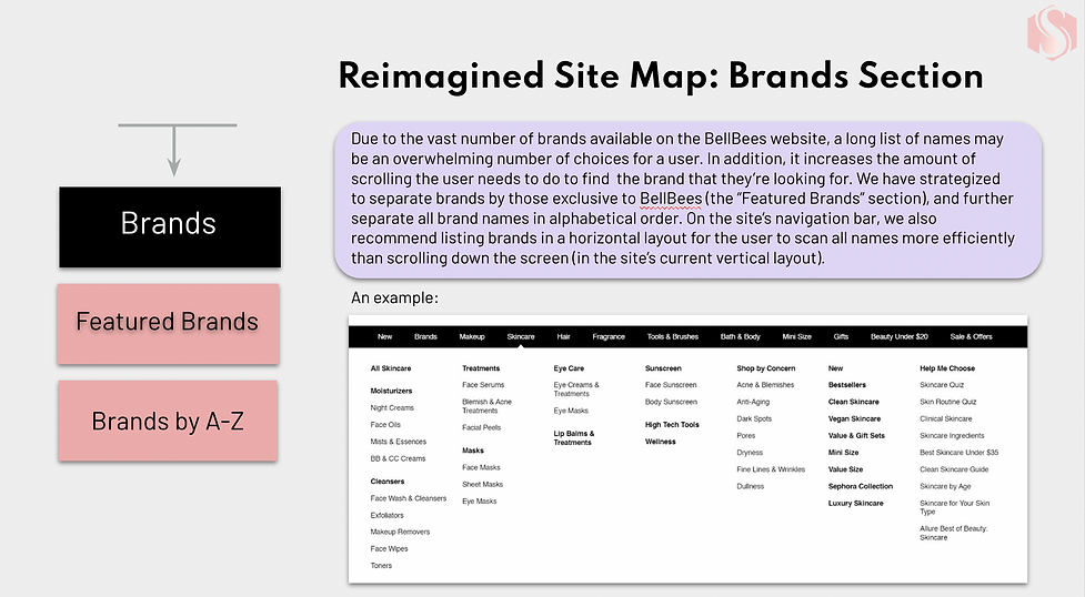
A. Architecture re-design


B. User Story


C. Prototype


04 Project feedback
The BellBees website has minimal design and doesn’t overpower the main content. The colors used accurately represent the brand message. The website doesn’t lack any key components.
However, in order to improve it, we could work on the following areas:
1. User-friendliness: The website has a lot to offer in terms of content and products which can sometimes be overwhelming. However, by using interactive features like filters and quizzes, we can substantially narrow down the search and make it more efficient.
2. A more luxurious experience: Creating an experience that is hyper-personalized, such as personal skin type or skin colour filters, would add to the brand image by reinforcing the feeling of luxury.
3. Consistency: A consistent layout is beneficial to unify the brand’s identity across multiple channels and make it more recognizable and in turn help the brand grow.